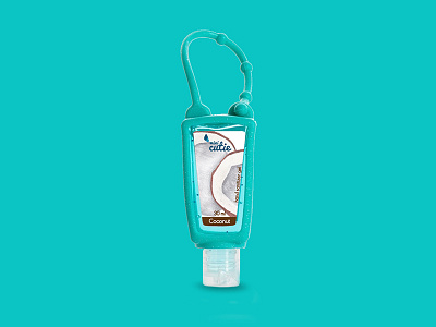
Mini Cutie - Label design
"Like most ideas, Mini Cutie was born out of necessity. The everyday life of New York required us to keep our hands clean during the day. But the problem was that most antiseptics smelled bad, they were impractical and boring. By doing extensive research, we found an antiseptic that was very close to what we imagined to be the perfect antiseptic. It smelled fine, it was useful and cute. Excited with our discovery, we went to work and started to design our own "perfect" antiseptic hand. We searched for and found the ideal ingredients, the most exciting perfumes and the perfect packaging.
A year later, Mini Cutie was released on the Greek market in order to change the way we use and see antiseptic hands. We believe that every cosmetic can be cute and cool and the antiseptic hand is just the beginning!"
This extensive research that people of Mini Cutie did, included my proposals for their future label design...
After extensive research and many illustrations and ideas, here are the results:
First of all, illustrations based on the flavors. These illustrations are colored with pens with glitter inside, which is quite similar with the "glittered" gel, inside the bottles.
see more:
behance.net/gallery/57355027/Mini-Cutie-Label-design
