Dribbble
I was tasked with creating an item comparison tool to train an image parsing machine at WalmartLabs
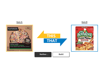
After being shown a base image (not pictured) the user compares 2 images to determine which most resembles the original. From here, the user makes their selection by either clicking the item's image or clicking the associated colored arrow in the center of the page. I anticipate most users will feel inclined to click directly on the item images, but I feel engaging with the page-centered arrows/buttons will be slightly quicker for users judging multiple image sets back-to-back.
Users can also select "Neither..." or "Both!" if they are unable to determine which image is the most similar. These options originally had longer descriptions (e.g. "Both images are equally similar") but I felt the wordiness was not worth the potential gains in clarity. I added punctuation (exclamation mark/ellipses) to give a bit more character to these buttons.
Upon selection, the associated button gains an inner shadow to relay a "depressed" state. If either Item A or Item B is selected, the image and arrow of the other is reduced to 30% opacity to give it a "grayed out" look. Both items are grayed out when "Neither..." is selected, and the button changes to a lighter shade of gray so that its inner shadow is visible (making it easier to identify the button as having been pressed)
The arrows point to their associated image. The images feature colored borders matching their arrows to further reinforce their relationship.
