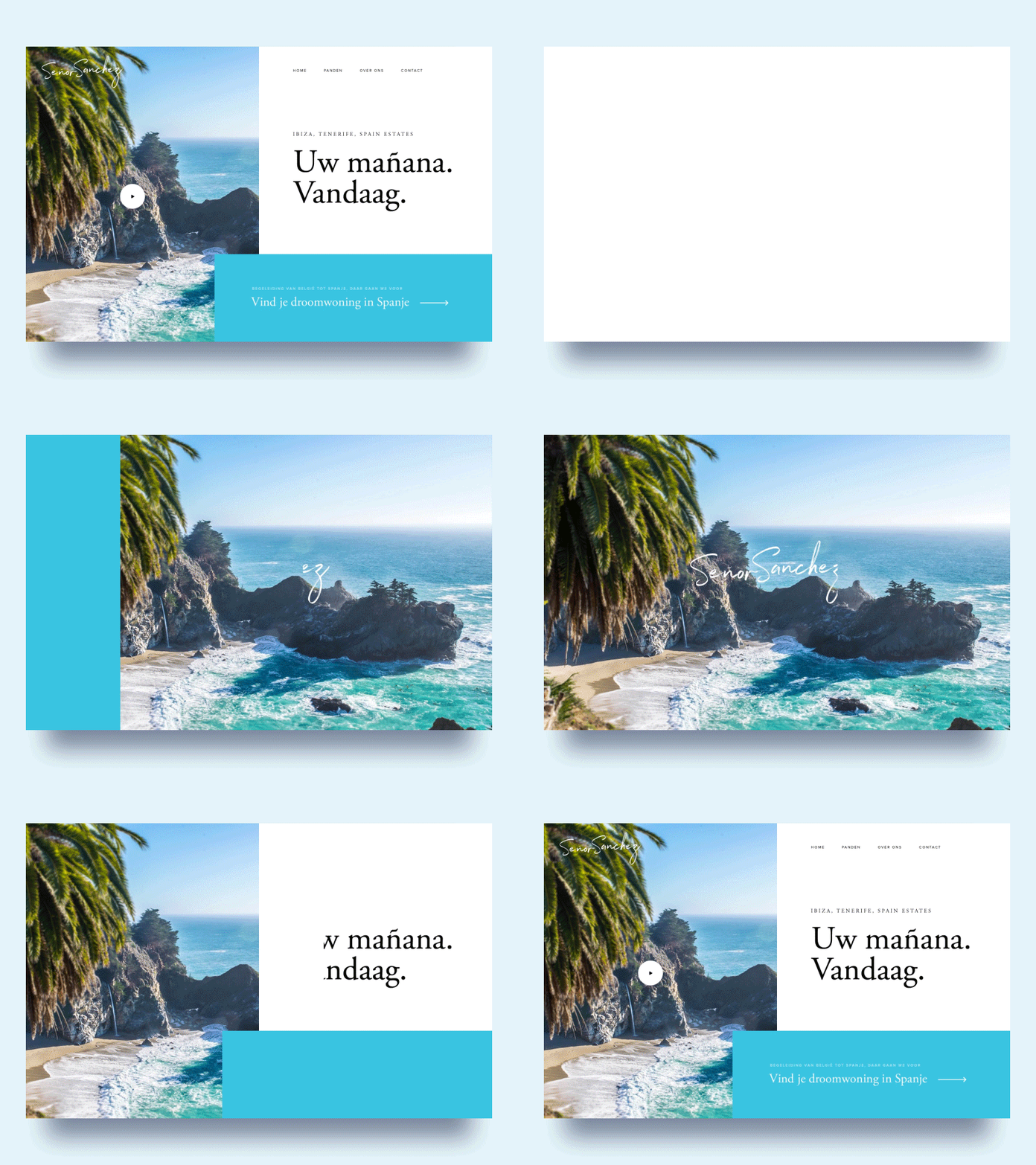
Onboard Animation
'Sup guys
Here's the hero section and the animation of the pageload of the 'about section' i posted last week. The problems we had with this design was that we didn't want to use text on images. Most of the time when you try to use text over images you'll have to use a dark overlay or a gradient or something but that makes the pictures darker and we wanted to keep the summer and sunshine vibes on this one (they sell houses in spain). We had the idea to have a picture first full screen so the user has the vacation/summer vibe and slide over to a split view for the text.
Let me know what you guys think!
Have a great week! Peace
More by Ollie View profile
Like


