Bayon Temple
2/52
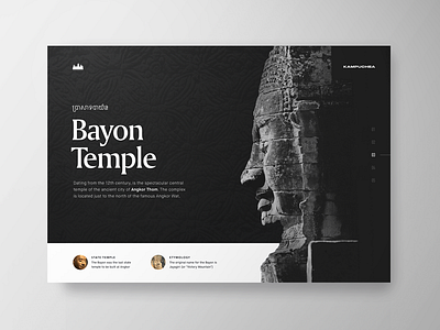
The Khmer alphabet was a little tough to pair with an English typeface.
I ended up using Amerigo as the headline, because it's strokes that resembled engravings. This stylistically had parallels both to the temple being represented, as well as the Khmer typography.