Evanston Lakeshore Logo
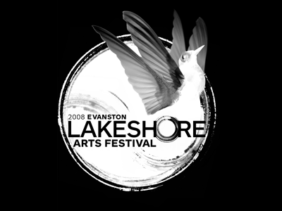
This was another identity I worked on. This one was meant to go on t-shirts whereas the festival identity took on the "drawn circle" vocabulary as a main stylistic convention for the other elements of the identity kit. The festival is right by Lake Michigan in the US, so themes of elevation, water, etc. became part of the approach to represent the artists present at the show! For some reason, I like this BW version better than all the colored versions I did!