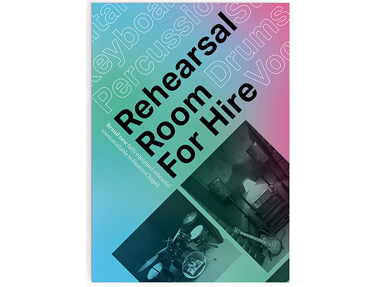
Typographic Rehearsal Room Flyer
For this client I was asked to design a double sided flyer to advertise a local music rehearsal room. Here I chose to use Aktiv Grotesk for the main information to give clarity to the message. For smaller information and to give insight to the rehearsal room I chose to create contrast between information by using an outlined version of Aktiv Grotesk as well as PT Serif. A main key to the design of the flyer is also how I’ve used type and layout to create the aesthetic illusion that both sides of the flyer are working together in harmony creating more of an object then two seperate sides to create a natural flow of information adding to the viewers experience of the flyer.
For more projects visit – www.andrewwolfenden.co.uk@a.Wolfenden@Andrew Wolfenden
