Kim Nunley (screenwriter) - branding & identity design
Most people who pen words will generally call themselves "writers." However, when Kim Nunley had called herself a "screenwriter" from the moment we had our first conversation. What precipitated out of that conversation was the idea to brand her efforts, even as an independent creative. At RDQLUS, the belief it that brands exist, whether you want them too or not, so—with Ms. Nunley—we assumed control of the identifying factors of her story in order to craft a brand & identity that she could advance her career and agenda in marketing herself and her work.
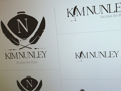
The main icon is a fresh take on a Victorian-style crest, devised of an initial, an inkwell and two feathers. The feathers are meticulously hand-draw, but although highly similar they are not identical. Same goes for the ink drops that trail off from their tips.
The identity system is built to be modular to allow maximum flexibility in use. Each of the pieces can be used singularly, as well as in conjunction with other pieces—such as the feather turned vertically and acting as the "I" in the writers name.
