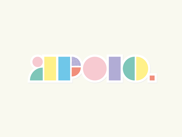
Apolo Kindergarten
I like the simplicity and joy that this version transmitted. The challenge was to create a iconic typography, understandable for the kids with the most simple and basic shapes: Lines & Points.
Btw this version was rejected :c
More by Giancarlo Colombo View profile
Like
