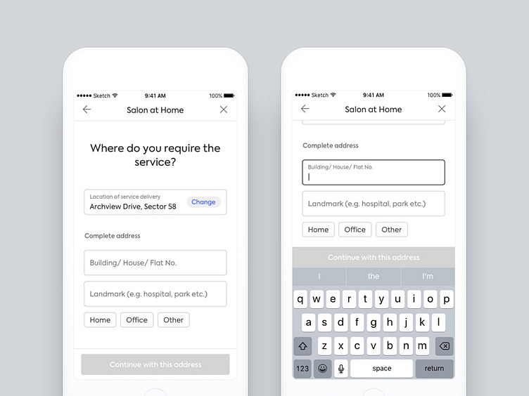
Separating address and scheduler in our platform + new forms
We are continuously improving our on-demand conversion funnel (read: Capturing user requirements for on-demand services) and in one of the exercise it made sense to separate Address selection/ Preferred Professional selection and Date, Time selection. (Currently all 3 appear in one screen due to which users mostly continue with the default selected options. They do not understand that they could actually change those options)
Designed for Android first by @Fozail Ahmed
More on this coming soon
More by Urban Company Design (formerly UrbanClap) View profile
Like
