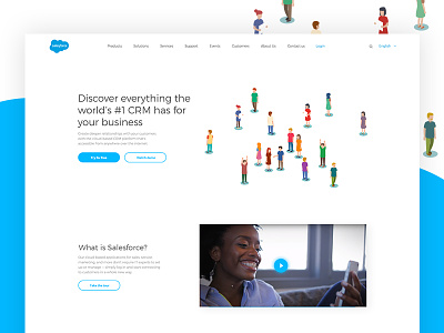
Salesforce Redesign Concept
A redesign concept of Salesforce. Salesforce is the biggest world CRM and, learning its website, we thought that it is too overwhelmed and complicated for the regular user. We decided to rethink the ui/ux of the main page. The purpose was to make it much lighter and easier for perception. When entering the website, the user could easily find out where he/she is and what kind of information he/she could find here. So, we started from a header with a clear CTA and the next section with a video that shows how Salesforce actually works.
The whole webpage concept you can see in the attachment.
Feel free to comment and share your opinion.
More by Ester Digital: NYC&London Web Design Agency View profile
Like

