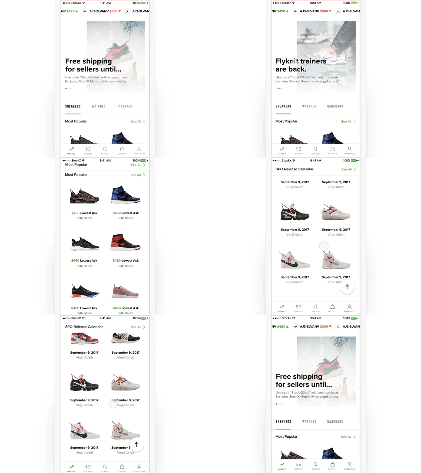
Homescreen Concept
For the past 8 months, I've been working nights and weekends with the StockX team over in Detroit. I'm crazy excited to welcome them to Dribbble and share what we've been working on.
This is one of 100 different concepts we put together for the new Market screen. A couple things are going on here:
We wanted the Market screen to feel new and fresh every time you came back to it. So, we explored a rich promotional section to keep buyers and sellers up to date whenever they open the app.
We also had to accommodate for multiple verticals (i.e. sneakers, watches and handbags) while also making it flexible enough to introduce more verticals in the future.
Lastly, we started thinking about vertical vs horizontal scrolling. By introducing vertical sections, we had to think about new scrolling behaviors and interactions.
Still working on the final version of this but just know we cookin'
🍳🔥
