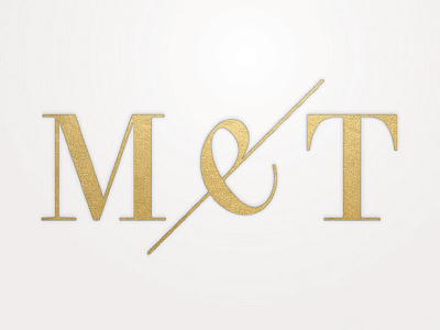
M e T
A logo that didn't quite make the cut (though I like the foil on fine paper feel). My favourite bit is the 'e-mpersand' - the central character is designed to be read both as & and as the italian 'e'.
More by Alex Magill View profile
Like
