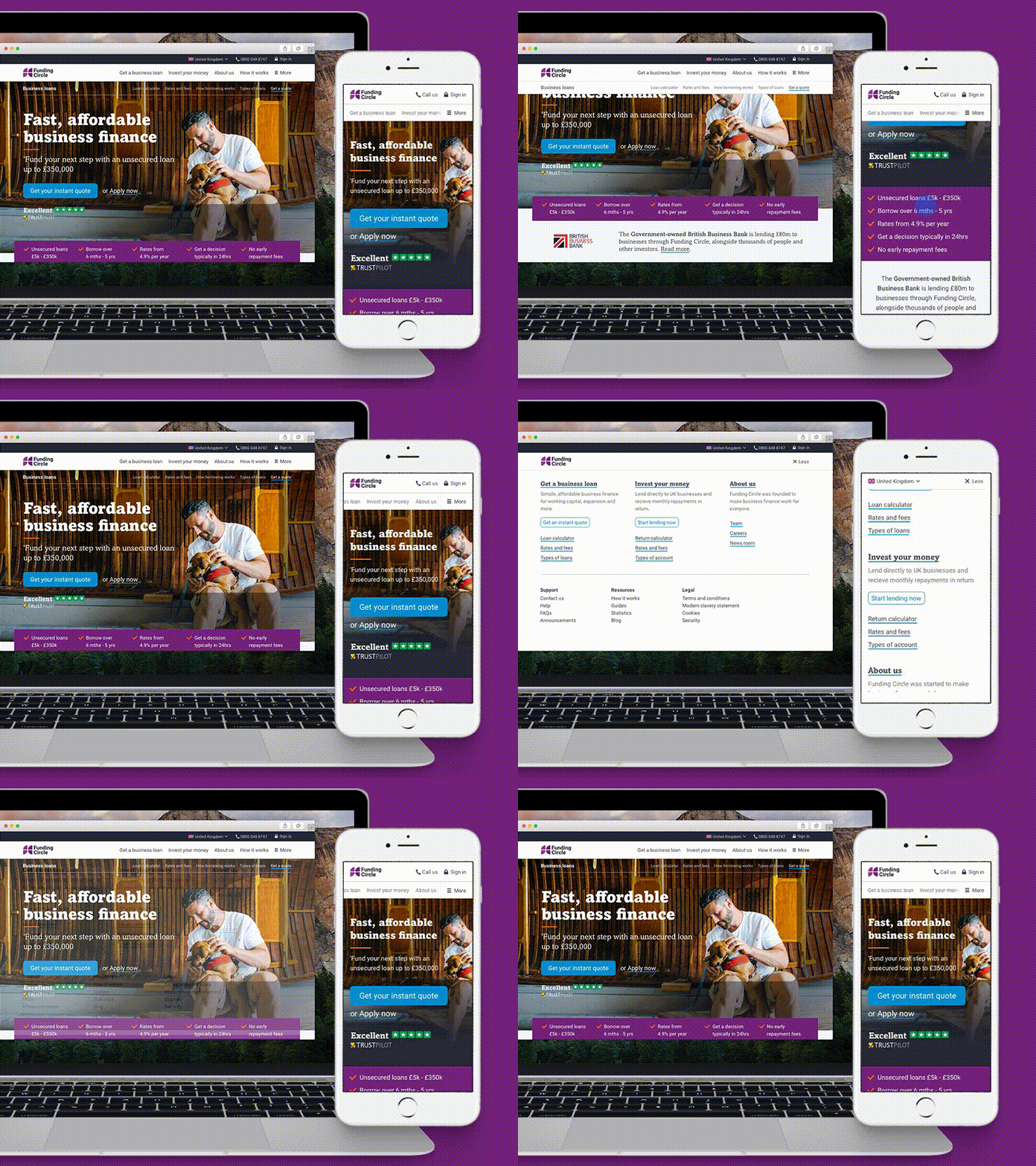
Funding Circle responsive brand refresh
Funding Circle has refreshed our brand, updating and consolidating our design language across the UK, US, Germany, and the Netherlands.
Key to this is a major redesign of the international website, rebuilding areas like the navigation and landing pages that had to accommodate three different languages and four different information architectures.
We also wanted to make sure that the site kept the same character and structure across desktop and mobile - keeping the experience on-brand and visually consistent regardless of device.
More by Andrew Sims View profile
Like
