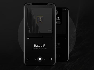
iPhone X - Music Player App UI Concept
Some concept explorations of the UI for the new iPhone. I think we will see a bigger shift of the navigation elements to the bottom of the screen. Its really interesting to see how the bar could be used for interactions.
In the second screen you can see(barely) that the top bar is pulled down and the Artist profile pops out with the function to follow. In that way you can easily track the artist that you like.
Currently working on the interactions of those screens.
--
Meanwhile you can follow us on:
Behance
Facebook
Instagram
More by Nikola Uzunov ☛ View profile
Like
