To Do App
If you like this concept, please vote for it here - https://www.uplabs.com/posts/to-do-app-mockup
After a few user interviews, I figured that a lot of people don't prefer using a To-Do app. The main reason behind it was that almost all the To-Do apps are complicated, and require the user to enter a lot of information before the app can actually be useful. A lot of them preferred using Notes app to put down their To-Do list.
Keeping this observation in mind, the goal was to design a really simple To-Do application, that gets more work done without letting the user go through the hassle of feeding a lot of data to the app.
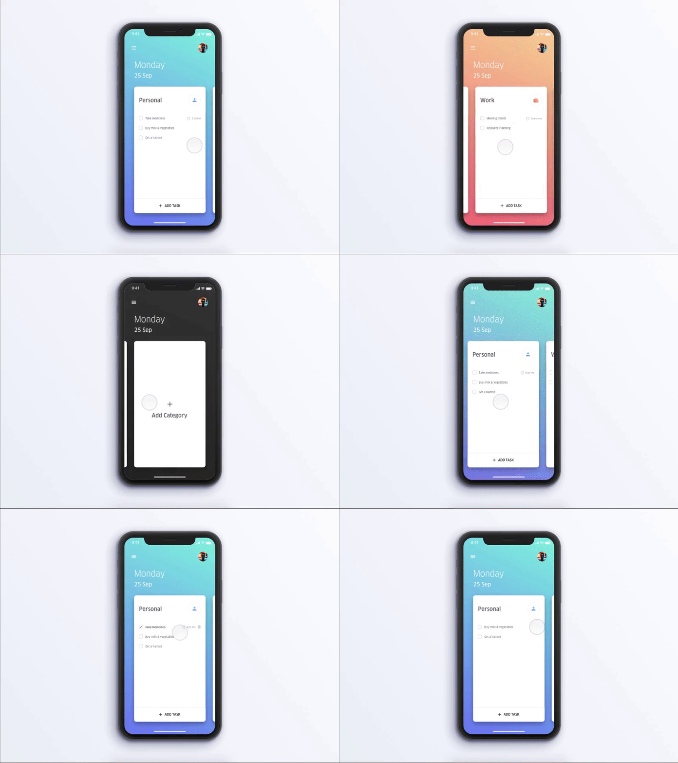
The design showcased here gets the most done with one screen. An interaction similar to Trello allows the user to switch between different categories. Marking a task done, or removing a task from the backlog is as easy as a tap. The user can also drag and drop to reorder the sequence of the task. An optional reminder for a task is available at the time of creation of the task.
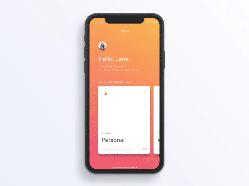
Here I've tried to enhance a concept introduced by @Jae-seong, Jeong for a To-Do App. Here's the link - https://dribbble.com/shots/3812962-iPhone-X-Todo-Concept Hope you guys like it.
Thank you @Jae-seong, Jeong for the iPhone X Mockup.

