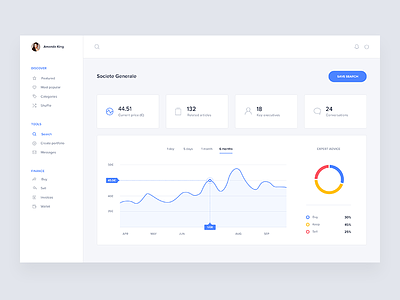
Stock value screen
Hi guys,
Today I’m sharing one of the first design exploration I made for a Fintech startup, here in London.
This screen shows a stock details. The 4 main tabs at the top are selectable. I’m working on an animation to explain the behaviour:)
See you next Monday for another shot
Have a wonderful week
The full case study is now on behance
More by Gregoire Vella View profile
Like
