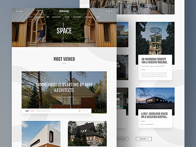
Gessato Magazine Redesign - Category Page
Continuing the collection of the re-design of Gessato's online web Magazine, a rich collection of the best Design Inspirations updated on a daily base.
This is the Category Page Design, composed by multiple thumbnail articles that follow the same rhythmic grid used for the Home Page, mixing floating cards and over-image styles.
Attached you can find the full Category Page Design.
More shots coming every day.
Check out the
Behance project's Collection of all the shots I posted since last year.
Follow me on:
Behance | Dribbble | Daily UI & Web Inspirations | LinkedIn
Get in touch at
matteo.dellac@live.it
More by Matteo Della Chiesa View profile
Like

