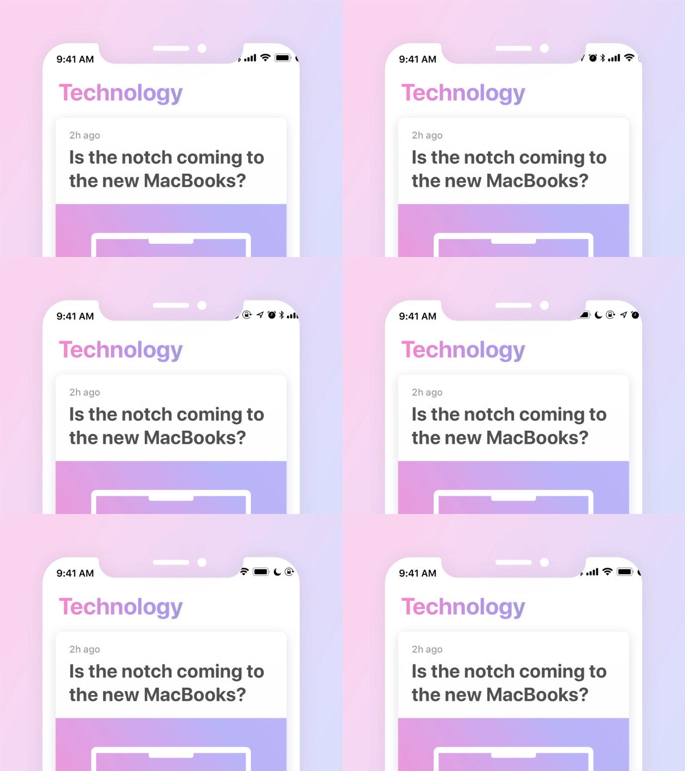
iPhone X status bar
The notch separated status bar on the iPhone X has some UI/UX issues:
The time. As seen in the presentation and UI guide, the 12 hour format loses AM/PM indication. So apparently people don’t need it any more. Shouldn’t the user experience be a satisfaction of user needs? Ok, even if people don’t need that indication, why is it present on the notchless iPhones? Shouldn’t the user experience be consistent across the product line?
The status icons. Apparently the only visible status indications on the right side are: network, wifi and battery. And the rest, like alarm, don’t disturb, orientation lock, etc. are available from control centre. Sorry, but I don’t have to swipe up, right, down or centre to see things that should be available at a glance.
All this confusing and non user friendly UI/UX in the iPhone X status bar raises questions: why does the notch exist in the first place and can the user experience be sacrificed for the eager to be different?
P.S. This shot is not a solution to these issues, but an illustration of them.
