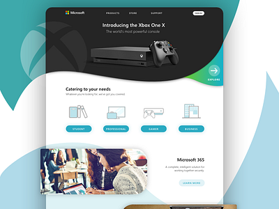
Microsoft Home Page Redesign
I thought it'd be interesting to try a rather different approach to Microsoft's home page -- instead of purely using straight lines and rectangular shape, using undulating curves to blend the content together.
More by Ji Hye Lee View profile
Like
