Readon
Hey! 🙌
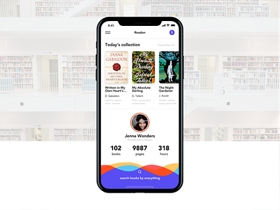
I continue testing designs on iPhone X, and today I wanna show you e-book application.
Let's dive into the structure of this screen.
The key-accent is made on user's stats - the higher progress is, the higher rank you have. Here it is "The Marvelous Reader". I think that function will help users to socialize and give them an opportunity to compete with others and as a consequence develop a passion to learn more.
Secondary accents are special books of the day, called collections, and search. Why search is made like this? Well, I know a lot of people who love reading, and its description "search books by everything" very accurately describes the functionality. Take a closer look at the books. Under each one you can find a short list of words (in book-case it's much bigger), that describes what is this book about or who is it for. I think giving so much space and paying huge attention to the search here is a must.
What's your opinion about it? 🤔
If you like it - please show some love by hitting "L".
Thank you for attention! 😉
Have interesting project? Drop me a line!
Behance | Instagram | Facebook
