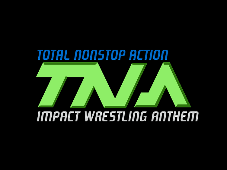
TNA Logo Revision
I did a little rebranding if you will to TNA, thinking since they went back to Impact Wrestling, going full on retro with bad bevels, and modern fonts, giving it an almost cheesy feel would help them in the long run, of course I would remove the bevel and go flat and such if they actually chose to even consider a branding, but just some fun to pass time if you will.
More by Tory Breakfast View profile
Like
