Mixd - 01
Here are some branding and packaging elements for a London-based retailer who's launching a new product line inspired by emotions, and which will taste like various cocktails.
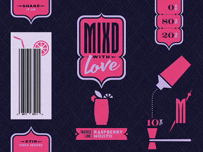
This product line will launch with 5 flavors. Shown here are elements and color scheme for the "Love" flavor, which will taste like Raspberry Mojito.
The challenge was to somehow visually combine certain emotions with cocktails. The client was interested in pursuing a sleek look — something on par with upscale fragrance branding.
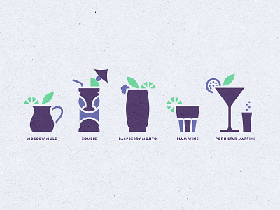
My solution was to employ an upscale — yet somewhat whimsical — visual style that is both retro and modern, and then use color, expressive lettering style, and background pattern to define each flavor's emotion. Simple bar and cocktail iconography rounds out the visual landscape, and each flavor gets its own cocktail icon.
The logo lockup holding shape is purposeful, and its construction was inspired by the construction of the logotype's M.
Z up those deets.
More to come! Until then, follow the progress of this brand here.

