2012 Portfolio Header Rebound
Next step is to try and inject a little personality into the header area of the redesign.
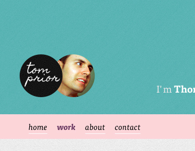
Gone for the oh-so-trendy circles to include some handwritten-style text, and a photo to add a personal touch.
What do people think of having your mug showing sitewide? Ok/uncool?
I've also added some *very* subtle textures to the header and body, and some friendlier copy alongside my photo to again get a bit of personality across.
More by Tom Prior View profile
Like

