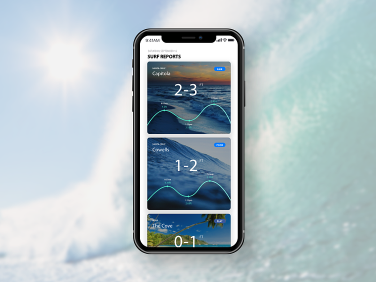
iPhone X - surf reports
Spent some time getting myself familiar with designing on iPhone X on a Friday afternoon, and can't wait to go surfing tomorrow!
Usability issue to solve - most of the surfing forecast apps show only the avg. surf height in the list view and the tide chart in the details view. I usually have to jump back and forth when comparing surf conditions between multiple locations. With this card design, users are able to see those two pieces of essential information at the same time.
Happy surfing!
More by Amy View profile
Like

