FinApp Redesign
Hello :)
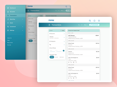
I spent a part of this week redesigning a few elements of one of my company's FinApps.
This application is meant to show the user all his past/future transactions across all his linked bank accounts. User's can also categorise, split or group their transactions to manage their financial health better.
Since this is a data-heavy app, it was important to rethink the placement of all the elements on this page and provide the user a cleaner, simpler view.
I'd appreciate any feedback you have for me :)
More by Shweta Nair View profile
Like

