Color Palette for Data Visualizations
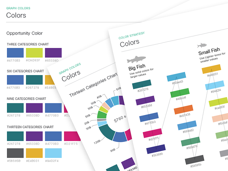
Using Colors for Data Visualization with Large Categories. Intelligent use of color helps a story in your data pop off the page and elicit specific emotions in users. Use of color consistently conveys the same meaning across all charts.
Read Article Here.
Do you need a partner to make your blue-sky idea a reality? Let's get together and roadmap your success.