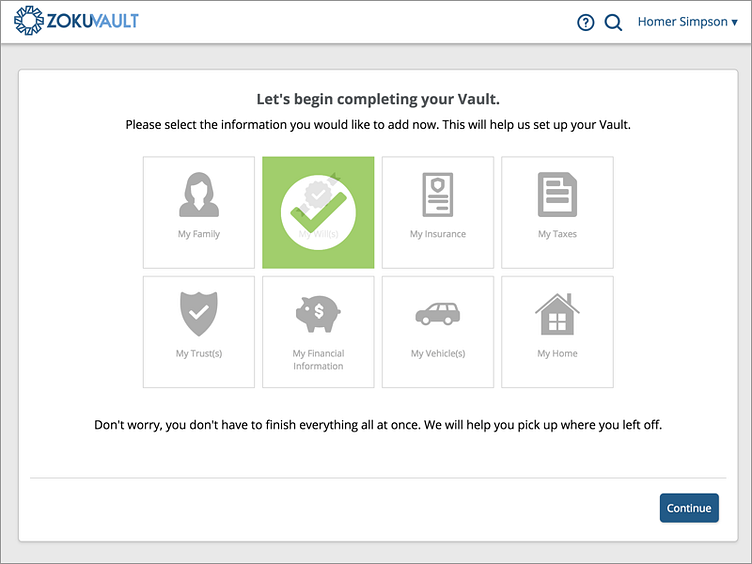
ZokuVault On-boarding Start Screen
We wanted to design an on-boarding experience that would create trust through transparency, allow our users to upload and share with a purpose, provide empowerment through direction, and showcase our security.
To meet these principles, we went with the 'one thing per page' approach to keep our users task focused and in control of their process and the data they are uploading into the Vault. With this design pattern, you end up creating a lot of screens.
This screen is the initial selection screen that allows a user to choose what categories of information they are going to complete in their first run.
More by Chris Orebaugh View profile
Like
