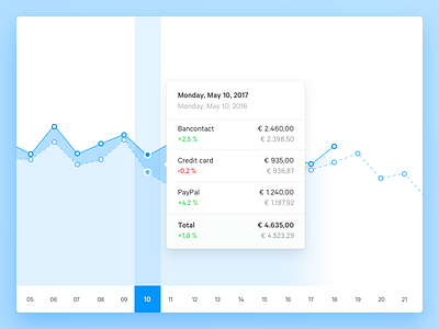
Statistics — Graph
The graph on the new statistics page in our dashboard has been changed from a bar diagram to a more descriptive line graph. It will automatically show statistics for your selected time period and always adds the corresponding previous time period. Now you’ll be able to see data like year-over-year growth at a single glance.
Read more about statistics on our Blog.
—
Follow me on Twitter
www.mollie.com
More by Mollie View profile
Like
