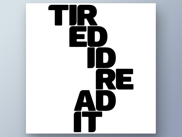
Big font readability experiments
With this experiment I was trying to improve the readability on a big font. By increasing the rounded corners on adjacent or opposite corners I'm trying to bring a more cognitive relation to letters that are supposed to be read together, even in an order that doesn't make sense.
More by Peter Waegemans View profile
Like
