TORU Redesigned
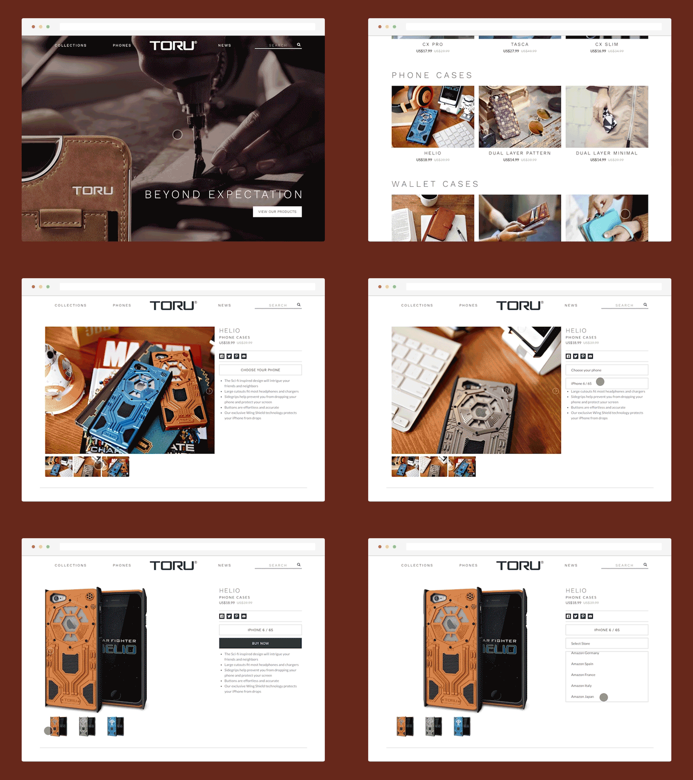
Last year we worked with TORU, a phone case company from South Korea, to redesign their online catalog. They had a unique problem in that they wanted to funnel all of their sales to local Amazon websites (.com, .co.uk, .jp, etc) instead of selling directly on their website. At the same time, they also wanted the flexibility to add other online stores like Shopify or Rakuten.
We approached this problem by designing an intuitive information architecture for their website with Collections and Phones at the top. Collections contain TORU's different product lines, while Phones give customers a chance to browse products based on the phone that they own.
Once you choose a case and phone model, you're then given the option to buy it from the different Amazon stores.
While e-commerce on their website would probably provide the best user-experience, we think this approach gives customers the familiar store interface, without requiring a massive logistical shift for the business.
Check it out here: https://toru.fashion
---
Hire kirigami
Interested in working with us to design and build your product? Email us at hello@kirigami.co
---
kirigami.co // Facebook // Twitter // Instagram // GitHub


