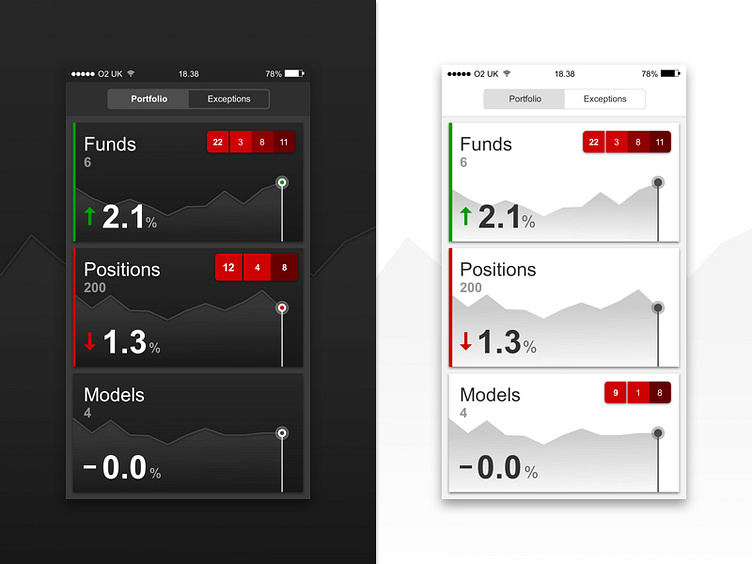
Exploring Dark vs Light UI
Couple of exploration designs from recent work on a fintech application. Really couldn't decide whether to go with the dark or light version for a long time. In the end went with a combination of the two, although brand later had a big part to play.
More by Will Sicat View profile
Like
