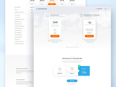
Answerforce - Pricing exploration
Task:
Prepare a new Pricing page that would show users 2 services Answerforce offers with quick explanation which does what. Page should also include a Bundle of these two services in one. On top of that, a user should understand that Live Answering has several other plans to choose from; meanwhile, IVR is single plan service. In the end, it should show which service is selected most often.
Result:
This was one of the hardest UX challenges I had gone through so far. The decision we ended up with was to show both services next to each other. For Live Answering, we display only one plan which helps the page to stay clean and easy to scan, without too many options a user can choose from. Each of these services has a hover state which show basic features of what is included. Underneath each service we explain to the user which one is the most popular.
We have gone through enormous amount of iterations, versions, tests and colaborations, at the end, the task has changed and the pricing page will have to as well. This challenge has again taught me something new I can build upon to get better!
You can see more of our work here.


