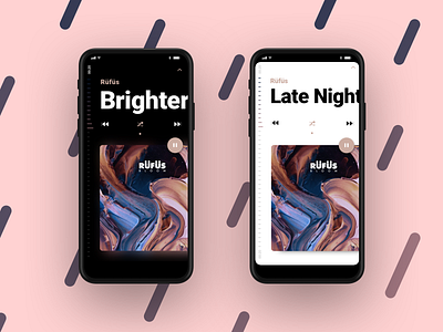
Music Player iOS 13
The current conventions of audioplayer start to bug me. Yeah I know people are used to things but with taller screens we can try new things, right? Here's my attempt at placing the progress on the left and trying a few editorial moves on typography and layout. I also created Iconography which is a bit more friendly and feels a little more lean. Let me know what you think and:
Hit "L"!
More by Julius Löwe View profile
Like

