Commercial
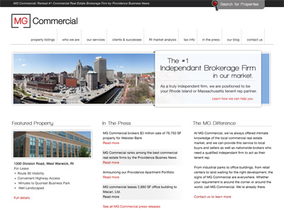
Part of a website "realignment" for a commercial real estate client that I have worked with for years. Instead of a pure redesign, I am taking what they have now (which uses black as the main color) and trying to invert the palette as much as possible for this "next evolution" of their website.
Full version is attached.
More by Jeremy Girard View profile
Like

