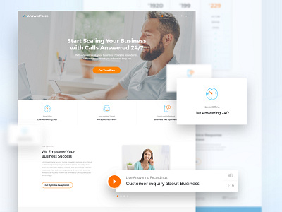
Answerforce - Landing Page
Back in 2015, we redesigned the landing page for Answerforce and helped raise conversion rates by more than 50%. Two years later, we were given another task to create one more version of a landing page that would explain to the users what is Live answering and how it works.
The best option for doing this was through a demo version of the service rather than plain text, and that’s what we decided to include on the new landing page. Another UX strategy that can sell your product is a comparison to different products which helps users make decisions between your product and various other options offered by other merchants.
If you want to improve your product with better UX just contact us or browse more of our work.
If you would like to learn more about Answerforce and their services visit their webpage here.

