Weather App Concept - Round 2
Weather App Concept - Round 2
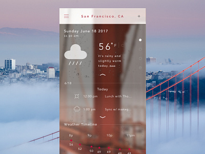
Spent some time iterating from the previous version and found that aligning the titles left (instead of centered) really helped with information architecture. And instead, centering the information about the day (Today, Tomorrow) was really a stronger use of center alignment. I think it has to do with the fact that less items on the page would be centered overall.
I added some additional UI elements as well:
- vertical pagination
- expand dropdown chevrons
- time line gradients
I chose a vertical pagination with hesitation, because users may confuse the controls with the entire screen. But I think the overall gains from not having to stretch your fingers to swipe left and right, might justify this. Perhaps in another exploration, I could make these more button-y, so users will have less confusion with an existing horizontal pagination control patterns.
Lastly, I'd still like to increase the lightness of colors used in the app. When previewing on my phone, the colors weren't so dull (as it might appear on desktop).