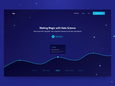
Homepage Design for Magic Data Analytics Company
Goal: website design for a cool and all-magic data analytics company.
Approach: we tried to stay “dreamy”, yet “data-ish” with a little bit of analytics, therefore we used this nice dark color scheme.
Result: we ended up with what we call “design magic” homepage, which, I’m sure, we’ll iterate over and over until we get it exactly the way we want it. Stay tuned!
Let us know what you guys think!
Don’t forget to follow Zajno on social media and feel free to drop us a line:
Website | TheGrid | Twitter | Instagram | Medium
More by Kostia Varhatiuk View profile
Like

