Wedding First Take
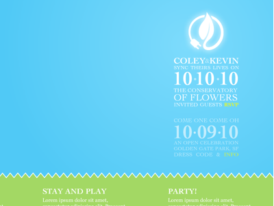
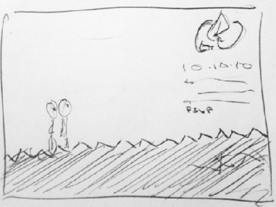
Translating sketch 1 and using the beautiful logo designed by Eris Stassi. The colour palette is a bit too pastel right now and needs to be more natural. It also looks pretty but lacks a personal feeling given it's about two people.
More by Kevin Cheng View profile
Like

