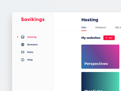
Hosting panel
Hey folks, here some update on my web hosting panel project.
Now that "UX" of the screens is finish I'm working to improve the visual part of UI.
・Since the last shot, I made the decision to put back the first level navigation on the left, in a dedicated area (instead of between the logo and the user menu in header) to make it more accessible.
・On the visual side I tried to make the UI more minimalist with more space to let it breath: the content is king.
・I had also switched to saturate colors and bold typo in order of stick more with the brand identity (but that's another story).
(Oh also, gradients and smooth shadows are back ! 😛)
More by Tixie View profile
Like
