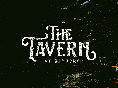
The Tavern
Boy have I had a difficult time nailing down this wordmark! When I first started the project, I wanted to go IN. I was initially set on the idea of some RIDICULOUS blackletter on wood-carved hanging signage.. but after months of fussing and frustration, I came to the realization that those ideas just were not a good match for the patrons of this restaurant. It's a popular outdoor eatery near campus under a big ole tree, and I didn't feel like the college students grabbing a grouper sandwich there were quite crusty enough for some hardcore gothic lettering.
I'm still up in the air about what to do for the little diamonds around "at Bayboro" but would love to hear any other critiques if possible. I'll hopefully be showing the results of the entire rebrand down the road!
