Homepage Design for Educational Analytics Startup
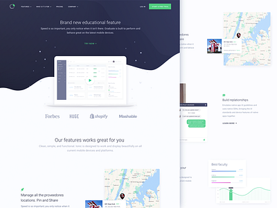
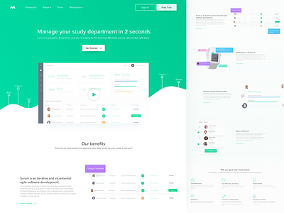
Goal: designing a clean homepage for an education-centered startup we collaborated with. We wanted to help visitors get as many insights about the platform as possible just from the main page without throwing too much information at them.
Approach: after multiple iterations we decided to stick to the clean and minimalistic representation of the information on the main page with purpose of getting the message across faster.
Result: as you can see, we played around with contrasting colors a bit, while keeping the page minimalistic and simple, doing our best to make the information easy to comprehend. The content will also be SEO-oriented for better search engine rankings.
Let us know what you guys think about this one!
Press "L" to show some love!


