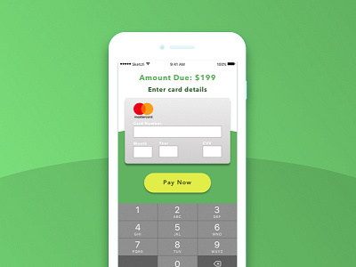
Credit Card Checkout
Daily UI #002. The idea here was to setup the screen to match the mental model we all have of a credit card to minimize confusion about where to enter the card information.
More by David O. Andersen View profile
Like
