Revised Homework Night Mobile


Thanks to everyone who has given me great feedback on this concept so far. This revision includes the input I’ve received plus a lot of fine tuning.
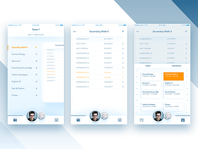
• Darkened the primary text and footer icons to give it more contrast and make it easier to see
• Used lowercase letters instead of all caps in some places and upped the font size in some instances to make things easier to read
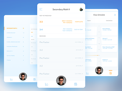
• Added shadows to the footer and the header to give them more depth and contrast
• Added both children to the footer so there are fewer taps to navigate between them
• Added the status bar and more fleshed out headers to all the screens
• Made the homework list smaller and tighter so it is easier to scan more assignments on a single screen
• Improved the readability of the schedule shelf and used orange to highlight the class the shelf was spawned from
• Changed the tint of the photos on the bottom to be more in brand and feel like they blend more with the rest of the screen
• Added a card stack to the class screen instead of seeing a single card at a time
I also wrote a longer narrative describing the app and why I designed it the way I did, it’s over here on medium at http://bit.ly/2gBTkGz
And an article on the iterations I went through on this project here http://bit.ly/2lDU4km