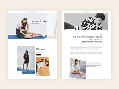
Samsoe - Scandinavian Simplicity
We were tasked to reposition, rebrand and ultimately reignite this trendy clothing retailer from the heart of Copenhagen.
The imagery is hip and sensory, invoking exploration and is relatable to living the Scandinavian lifestyle. The editorialized stories are straight forward, cutting through the clutter and going more directly at a no nonsense shopping experience.
Using asymmetry, we create a dynamic and vibrant experience with the users craving and wanting more as they are intrigued by things not being your standard shopping experience. For desktop, we use a 16 column grid to really push the design as far as possible, which helps creating an off-grid / avant-garde feel. This grid is simplified as we get down to the smaller tablet and mobile sizes.
Check out full case study and mobile versions on www.detonate.se


