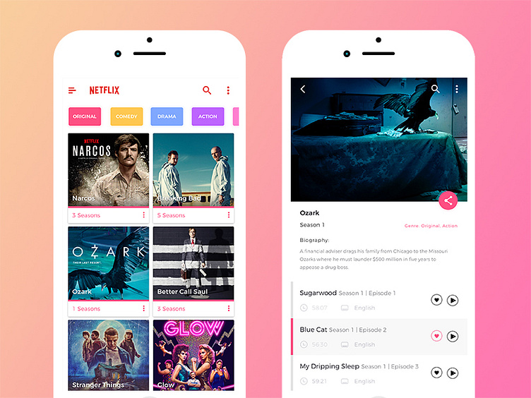
Netflix UI/UX App Redesign
View at Behance in full glory (2X pixels)
Wanted to redesign the Netflix App. So I choose to make the UI more colourful, cheerful and cleaner.
Also wanted to improve the user experience by making it easier to find series in subgenres. Right now it is filtered on 'Original', which is why it has the pink overlay in texts and stuff. So now you can see the exclusive (original) Netflix series.
But ofc you can also filter on the other subgenres such as action, drama,.. etc.
More to come soon (animations)! Stay tuned by following me.
More by Thomas Debelder View profile
Like
