Logo Options
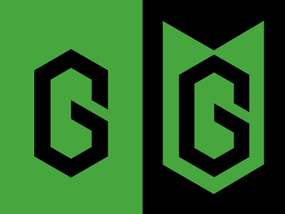
Looking at a couple of different options for this hexagonal "G" logo. Playing around with a shield, tactical look.
Which do you think is more interesting.
I like the left because its more simple, but the right has some potential. Meant for Hats, shirts and emblems on gear.
More by Dixon Garett View profile
Like
