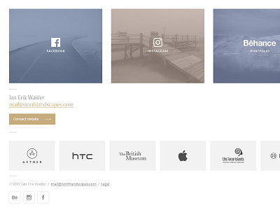
Photography Portfolio / Social Media Buttons
I'm working on the new design of my photography portfolio and wanted to put the most important social media buttons below the gallery grid.
The primary colors of the brands attracted way too much attention and so I came up with this idea using semi-transparent photos and pastel colors as background for the icons.
—
see the @2x version for more details.
Visit my photography portfolio on Behance.
More by Jan Erik Waider View profile
Like
