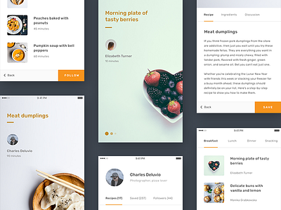
Recipes App Concept
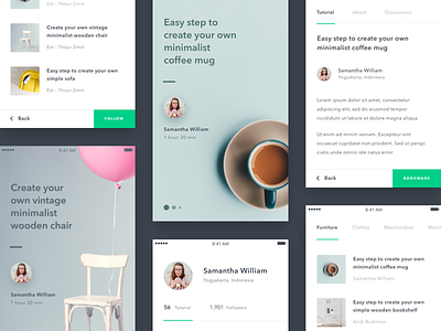
I was fascinated by the style @Dwinawan from @Paperpillar created, so I decided to adapt this concept to another use case – recipes! The idea to put the navigation elements at the bottom to let people use their thumbs to move around the app is awesome. It becomes more and more relevant with bigger screens.
I played with colors, fonts and photography to come up with this shot. Hope you guys like it!
Follow me here and on Instagram!
Do not forget to support me by pressing L if you like this shot!
And please tell me what you think in comments! I would be glad to hear your thoughts and feedback :)
More by Vlad Fedoseyev View profile
Like


