Visual Design Guidelines
Second part of our guidelines at www.festicket.com
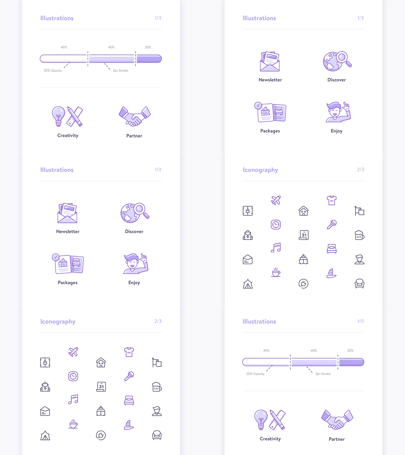
Based on all the visual elements that get along with the UI components.
Both designed with rounded strokes, the spot illustrations are showing off a tri-color system that should contrast with the iconset.
More by Festicket View profile
Like


