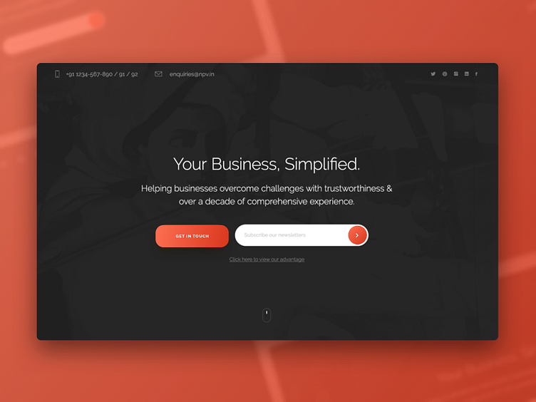
Daily Ui Challenge #15
A landing screen design which is simple yet it has a professional look to it. With main emphasis on the messaging. With the use of contrasting colors that compliments the text that needs highlighting in this landing page. Hope you guys like it!
Please press "L" if you like it. Thanks for watching!
More by Ajit Pai View profile
Like
